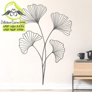
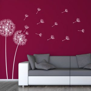
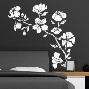
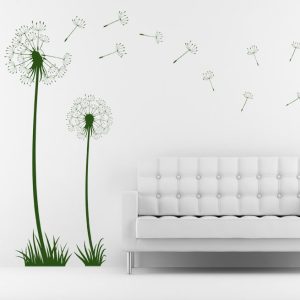
خرید استیکر دیواری گل :برچسب دیواری ارکیده
استیکر دیواری گل ارکیده با خرید استیکر دیواری گل این برچسب دیواری ارکیده حسی عجیب و غریب را به دیوار شما می آورد.
کوچک: (عرض x ارتفاع)35 در 60 سانتی متر
متوسط: (عرض x ارتفاع)54 × 100 سانتی متر
بزرگ: (عرض x ارتفاع) 87 × 160 سانتی متر
<div class=”container”>
<div class=”btn”><a لینک=”#”>سینا عزتی </a></div>
</div>
.container { display: flex; flex-wrap: wrap; justify-content: space-around; width: 200px; } .container .btn { height: 50px; margin: 20px; margin-bottom: 40px; position: relative; width: 155px; } .container .btn a { align-items: center; background: rgba(255, 255, 255, 0.05); border-bottom: 1px solid rgba(255, 255, 255, 0.1); border-top: 1px solid rgba(255, 255, 255, 0.1); border-radius: 30px; box-shadow: 0 15px 35px rgba(255, 255, 255, 0.2); color: #fff; display: flex; font-size: 18px; font-weight: 700; font-family: inherit; left: 0; top: 0; position: absolute; height: 100%; width: 100%; justify-content: center; text-decoration: none; overflow: hidden; -webkit-backdrop-filter: blur(10px); backdrop-filter: blur(15px); z-index: 1; transition: 0.5s; } .container .btn:hover a { letter-spacing: 0px; font-size: 22px; } .container .btn a::before { content: ''; position: absolute; top: 0; left: 0; width: 50%; height: 100%; background: linear-gradient(to left, rgba(255,255,255,0.15), transparent); transform: skewX(45deg) translateX(0); transition: 0.5s; } .container .btn:hover a::before { transform: skewX(45deg) translateX(200%); } .container .btn::before { content: ''; position: absolute; left: 50%; transform: translateX(-50%); bottom: -5px; height: 10px; width: 30px; background: rgb(63, 238, 10); border-radius: 10px; transition: 0.5s; transition-delay: 0s; } .container .btn:hover::before { bottom: 0; height: 50%; width: 80%; border-radius: 30px; transition-delay: 0.5s; } .container .btn::after { content: ''; position: absolute; left: 50%; transform: translateX(-50%); top: -5px; height: 10px; width: 30px; background: rgb(7, 245, 59); border-radius: 10px; transition: 0.5s; transition-delay: 0s; } .container .btn:hover::after { top: 0; height: 50%; width: 80%; border-radius: 30px; transition-delay: 0.5s; } .container .btn:nth-child(1):before, .container .btn:nth-child(1)::after { background: #0cf318; box-shadow: 0 0 5px #0ffb2e, 0 0 15px #2bff59, 0 0 30px #32ff2b, 0 0 60px #22ff47; } .container .btn:active a { color: #000; }
نقد و بررسیها
هنوز بررسیای ثبت نشده است.